
Optimizing images for your website isn't some dark art. It really just boils down to a simple formula: pick the right format, shrink the file size, and then serve it up smartly. When you nail this, your site gets faster, your visitors are happier, and Google gives you a nice little nod in the rankings. Your images become a performance asset, not an anchor dragging your site to the bottom of the ocean.
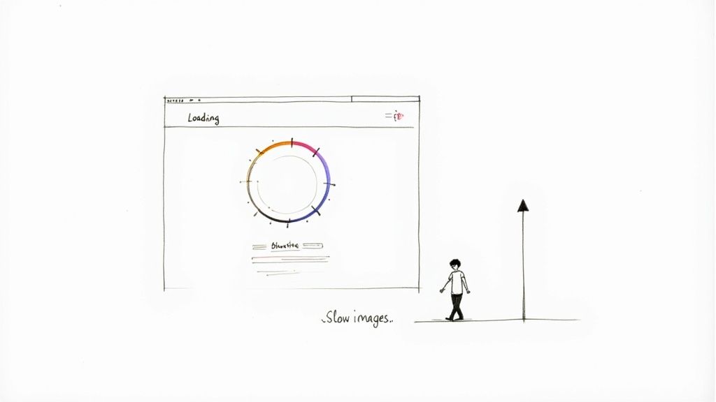
Why Slow Images Are Your Website's Kryptonite
Let's get straight to the point: slow-loading images are one of the biggest reasons people will ditch your site and never come back. Every single unoptimized photo or graphic is a digital speed bump, ticking off your visitors and slowly eroding your credibility. It's the silent killer of user engagement.
Picture this: a potential customer lands on your slick e-commerce site. They're greeted by a stunning hero shot… that takes a full five seconds to load. Annoyed but persistent, they click on a product, only to watch the gallery photos crawl into view one by agonizing one. By the time the page is usable, their initial excitement has evaporated, and they’ve already bounced over to a competitor who gets it right. This isn't just a tech hiccup; it’s a direct punch to your revenue.
The True Price of a Sluggish Visual Experience
The damage from slow images goes way beyond a bad first impression. It sends a destructive ripple effect through all the metrics you care about.
- Bounce Rates Through the Roof: Let's face it, nobody has time to wait. Staggering data shows that 53% of mobile users will abandon a site if it takes more than 3 seconds to load. And what's usually the heaviest thing on a page? You guessed it.
- Conversion Rates in a Nosedive: Every extra second of load time is proven to chip away at your conversion rate. If your "Buy Now" button is held hostage by a lazy-loading product shot, you're literally watching money walk out the door.
- Plummeting SEO Performance: Search engines like Google are obsessed with user experience. A site bogged down by heavy visuals will get hammered on its Core Web Vitals scores, which translates directly to lower search rankings and less free traffic.
The big takeaway here is that knowing how to optimize images isn't just a neat trick for web developers—it's a non-negotiable skill for anyone who wants to win online. It's as fundamental as writing a good headline.
In the rest of this guide, we'll dive deep into a practical comparison of modern image formats, review the best tools for the job, and look at some powerful alternatives for putting your entire optimization workflow on autopilot. For a glimpse into how the pros handle this at scale, you can even check out tools like the PixelPanda API for automated image processing.
Picking The Right Tool For The Job: A Guide to Image Formats
Choosing the right image format is your first, and maybe most important, decision in the quest for a faster website. Getting this wrong is like showing up to a go-kart race with a monster truck. Sure, it's big and powerful, but it's clumsy, slow, and completely wrong for the job.
It’s not just about the classic JPEG vs. PNG debate anymore. We’ve got new, powerful contenders that can slash your file sizes without making your visuals look like they were made in 1998. Let's dive into what you should be using and when.
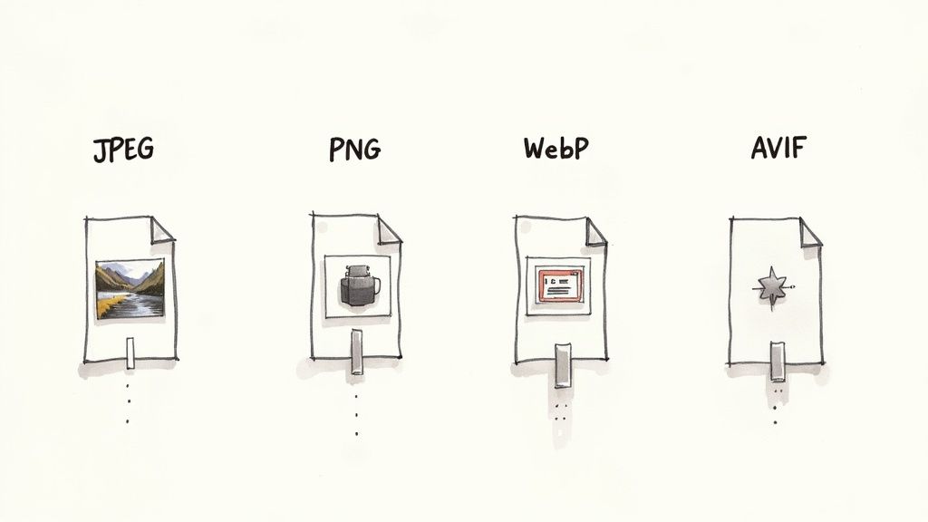
The Old Guard: JPEG and PNG
For years, the rules of the road were simple. Use JPEGs for photos, and use PNGs for graphics that need a transparent background. While that's still a decent starting point, clinging only to this rule means you're leaving a ton of performance on the table.
-
JPEG (Joint Photographic Experts Group): This is the workhorse for photographs and anything with complex color gradients. It uses lossy compression, which is a fancy way of saying it cleverly throws out tiny bits of data your eye won't miss, all to shrink the file size.
-
PNG (Portable Network Graphics): The undisputed hero for logos, icons, and any graphic that needs a see-through background. PNGs use lossless compression, so every single pixel is preserved. This is fantastic for quality but often results in much larger files.
The trade-off here is pretty clear. A product photo saved as a PNG will be ridiculously huge, while a logo saved as a JPEG will look fuzzy and unprofessional. You've got to match the format to the content.
Don't get stuck in the past. JPEG and PNG are reliable, but treating them as your only options is a huge mistake. The real performance gains come from embracing their modern replacements.
The Modern Challengers: WebP and AVIF
Okay, this is where the real magic happens. WebP and AVIF are next-generation formats built from the ground up for the web, offering far better compression than their older cousins.
WebP: The New Standard
Developed by Google, WebP is the versatile champion of the modern web. It can handle both lossy and lossless compression, supports transparency like a PNG, and can even do animations (bye-bye, clunky GIFs!). The best part? WebP files are typically 25-34% smaller than equivalent JPEGs with virtually no visible difference in quality. Browser support is now rock-solid, making it a safe and incredibly powerful choice.
AVIF: The Future is Now
AVIF (AV1 Image File Format) takes things to another level. It often produces files that are a staggering 50% smaller than a comparable JPEG. It’s the new kid on the block, backed by tech giants like Netflix and Microsoft. While browser support isn't quite as universal as WebP yet, it's growing fast and represents the absolute cutting edge of image optimization.
This screenshot from Squoosh, an awesome in-browser compression tool, shows a direct comparison. Notice how the AVIF version achieves a mind-boggling 91% file size reduction compared to the original, while the visual difference is almost impossible to spot with the naked eye.
Image Format Comparison: A Quick Guide
Feeling overwhelmed? Don't be. This table gives you a quick side-by-side review to help you choose the best format for different situations.
| Format | Best For | Key Feature | File Size |
|---|---|---|---|
| JPEG | Photographs, complex images without transparency | Universal support, good for complex scenes | Medium |
| PNG | Logos, icons, graphics with transparency | Lossless quality, full transparency support | Large |
| WebP | The all-around replacement for JPEG & PNG | Excellent compression, transparency, animation | Small |
| AVIF | High-quality photographs where size is critical | Best-in-class compression, cutting-edge quality | Smallest |
Ultimately, your goal is to use the most modern format that fits your needs and is supported by your users' browsers. For most sites today, that means leading with AVIF or WebP and keeping JPEG/PNG as a fallback.
Making the Right Choice: Your 2-Question Checklist
So, how do you decide? Just ask yourself two simple questions.
1. Does my image need a transparent background?
- YES: Your best bet is WebP. It will almost always give you a smaller file than a PNG. Only use PNG as a fallback for really old browsers that might still be lurking around.
- NO: Great, move on to the next question.
2. Is the image a photograph or does it have complex colors?
- YES: Go with AVIF first, and use WebP as your next-best option. Both will dramatically outperform an old-school JPEG. If you're worried about quality after heavy compression, you can always explore tools to sharpen the final output. For instance, you can see how AI handles this with an image upscaling demo to restore lost details.
- NO (like a simple logo or icon): Stick with WebP for raster images, but you should really be using SVG (Scalable Vector Graphics). SVGs aren't raster formats at all; they're code-based, infinitely scalable, and have a tiny file size.
That's it! By running through this quick mental checklist, you can confidently pick the perfect format for nearly any image, striking that perfect balance between stunning visuals and a lightning-fast website.
The Honest Guide to the Best Compression Tools
Alright, you’ve picked the right image format. Now for the real magic: making that file tiny without turning your gorgeous photo into a blocky mess from 1998. This is the art of compression, and it all boils down to two main philosophies: lossy and lossless.
Think of it like packing a suitcase.
Lossless compression is for the meticulous packer. You fold everything perfectly, roll your socks, and use vacuum-sealed bags. Nothing gets left behind. The suitcase (your image file) is smaller, but every single piece of clothing (pixel data) is still there, untouched. It’s perfect for quality, but the size reduction is pretty modest.
Lossy compression, on the other hand, is for the pragmatic, ruthless packer. You look at those five nearly identical t-shirts and admit you only really need two. You toss the extras, making the suitcase way lighter. Lossy compression does the same thing, intelligently throwing away bits of image data your eyes probably won’t even notice. The result? A massive drop in file size with a barely perceptible dip in quality.
For almost everything on the web, lossy is your best friend.
Don't underestimate the impact. A massive six-month study by Optimole saw them process 26 million images. They crunched the original 9.6 TB down to just 1.0 TB—that's an average reduction of 80-90%! This aggressive trimming cut visual loading times in half and boosted PageSpeed scores by 30-40%. You can dig into the numbers in the full technical SEO statistics report.
But enough theory. Let’s get our hands dirty with the tools that actually do the work.
Browser-Based Tools for Quick Fixes
When you just need to shrink one or two images, there's no need to download anything. These web-based tools are fast, free, and surprisingly powerful.
TinyPNG and TinyJPG
TinyPNG (and its identical twin, TinyJPG) is the undisputed king of quick-and-dirty compression. It’s been around forever for a reason. The interface is gloriously simple: you just drag, it squishes, and you download.
It uses a smart lossy algorithm that consistently hits a sweet spot, often knocking 50-80% off the file size without you noticing a thing. It's the go-to first stop for countless pros.
Squoosh by Google
If TinyPNG is a trusty hammer, Squoosh is the whole toolbox. This app, straight from the brainiacs at Google, gives you an insane amount of control right in your browser. You can resize, fiddle with the color palette, and—this is the best part—see a real-time, side-by-side comparison of different formats and compression levels.
Squoosh is basically a training ground for your eyes. Drag that quality slider back and forth. Watch the file size plummet and see exactly when the image starts to look crunchy. You’ll quickly build an instinct for how far you can push it.
Desktop Software: The Power User's Choice
When you're dealing with a whole folder of images or need to work offline, desktop apps are the way to go.
-
ImageOptim (Mac Only): A long-time favorite in the Mac community, this free tool is a beast. It throws a whole suite of compression algorithms at your images to wring out every last byte. It’s pure drag-and-drop simplicity with seriously powerful results.
-
RIOT (Windows Only): Standing for Radical Image Optimization Tool, RIOT is a fantastic freebie for Windows users. It gives you a live before-and-after view so you can tweak settings and immediately see the impact on quality and file size.
-
Adobe Photoshop: If you're already in Photoshop, don't overlook the classic "Save for Web (Legacy)" feature. It offers incredibly fine-grained control and a detailed preview window, letting you dial in the settings for that perfect balance. It’s all about precision here, though it can be a bit slow for bulk work.
Automated Solutions: Set It and Forget It
Look, manually compressing every single image is a soul-crushing task, especially on a big website. Automation is the only sane way to handle images at scale.
The choice really comes down to control versus convenience.
| Tool Type | The Good | The Bad | Perfect For… |
|---|---|---|---|
| Online Tools | Free, fast, zero installation | Limited batch processing, manual up/download | Quick, one-off image shrinks |
| Desktop Apps | Works offline, total control | Needs to be installed, OS-specific | Designers who need granular control |
| Automated Plugins | Hands-off, bulk optimization | Can add site overhead, often has a cost | Anyone with a big WordPress site |
For the millions of us on WordPress, plugins like Smush, ShortPixel, or Imagify are game-changers. You install one, and it quietly works in the background, automatically compressing every image you upload. It’s a true "set it and forget it" solution.
For developers building custom sites or apps, an API-first service like PixelPanda is the ultimate move. You integrate their API, and suddenly you have a complete image processing pipeline. It can automatically compress, resize, convert to next-gen formats, and serve images from a CDN, all without you ever thinking about it again. It’s how you ensure every single image is perfectly optimized, every single time.
Smarter Delivery with Responsive Images and Lazy Loading
You've picked the perfect format and compressed your image into a lean, mean, web-ready machine. Fantastic! But don't pop the champagne just yet. The final piece of the puzzle isn't just what you serve, but how you serve it.
Sending a massive, 1920-pixel-wide hero image to a tiny mobile screen is like trying to fit a grand piano through a cat flap. It's clumsy, wasteful, and slows everything to a crawl.
This is where smart delivery comes into play. We need to serve up images that are perfectly tailored to each user's device. With 60% of global visits now coming from mobile users, this isn't just a "nice-to-have"—it's non-negotiable.
Making these tweaks can seriously lift your Core Web Vitals compliance, which has been shown to improve rankings and user engagement by as much as 24% in some markets. For a deeper dive, check out the latest web design statistics and findings.
Serving the Right Size with Responsive Images
The one-size-fits-all approach is dead. Responsive images are the answer. By using simple HTML attributes like srcset and sizes, you can give the browser a whole menu of image options and let it pick the best one for the current screen size.
Think of it like this: instead of a single image file, you provide a whole set.
hero-image-small.jpg(perfect for phones)hero-image-medium.jpg(great for tablets)hero-image-large.jpg(for those big desktop screens)
The browser does the heavy lifting, picking the most efficient option and preventing a tiny phone from wasting bandwidth on a giant desktop image it can't even display properly. It's a total game-changer for mobile performance.
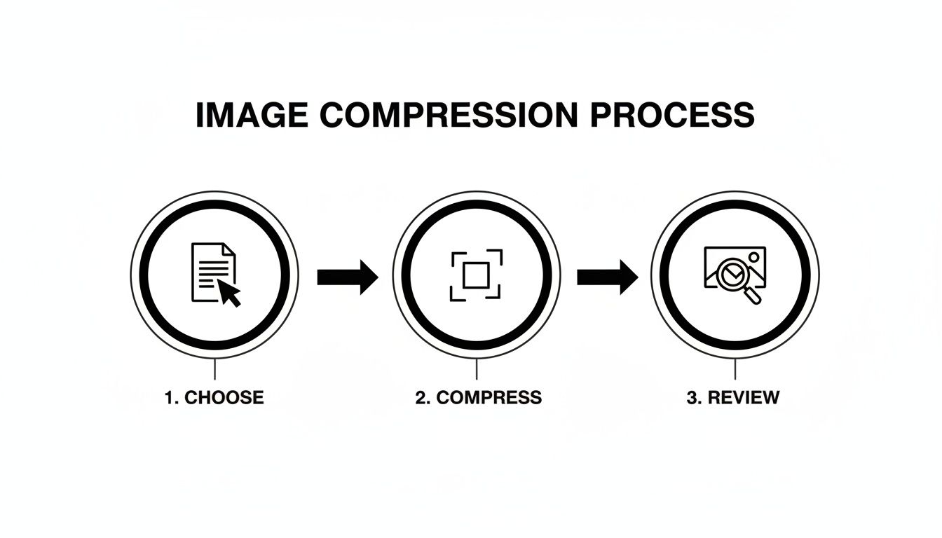
This whole process follows a simple, three-step workflow: pick the right format, squash that file size down, and give it a quick quality check.
Nailing this upfront makes smart delivery techniques like lazy loading even more powerful.
The Magic of Lazy Loading
Now for my favorite trick: lazy loading. By default, a browser tries to download every single image on a page the moment it loads—even the ones buried way down in the footer that the user might never see. What a waste of time and data.
Lazy loading flips that script entirely. It tells the browser, "Hey, only load the images inside the viewport. For everything else, just wait until the user actually scrolls down to it." This makes that initial page load lightning-fast, which is absolutely critical for keeping impatient visitors from bouncing.
Your Lazy Loading Options
You’ve got two main ways to pull this off, each with its own quirks.
-
Native Browser Lazy Loading: This is the path of least resistance. Just add
loading="lazy"to your<img>tag, and modern browsers handle the rest. It's clean, simple, and requires zero extra code. The only catch? It won't work on ancient browsers, but at this point, its adoption is so widespread it’s almost a non-issue. -
JavaScript-Based Libraries: Need more granular control or have to support that one client still using Internet Explorer? JavaScript libraries like lazysizes or Lozad.js are your friends. These lightweight scripts offer more customization, like cool fade-in effects as images appear. They're fantastic alternatives when you need that extra bit of flair or must cater to an audience on outdated tech.
My two cents? Just start with native lazy loading. It’s a one-word addition that solves 95% of the problem with zero overhead. Only reach for a JavaScript solution if you have a specific, undeniable need that native can't cover. It’s the definition of working smarter, not harder.
Finally, to truly supercharge your delivery, serve all your images through a Content Delivery Network (CDN). A CDN is a global network of servers that caches your images all over the world. When a user in Tokyo visits your site, the images get served from a server in Asia, not one in Texas. This slashes latency and makes your site feel incredibly snappy for everyone, everywhere. It’s the final, crucial step in mastering image optimization.
Turning Images into SEO Powerhouses
So far, we’ve been treating images like performance cargo—something to be squashed down and made as light as possible. But let's flip that script. What if every single image on your site was also a powerful magnet for search traffic? When you get this right, your visuals stop being a drag on page speed and start pulling in brand-new visitors.
This isn't just about loading faster; it's about getting found. And it all starts with telling search engines what they're actually looking at.
Crafting Alt Text That Actually Works
Forget the tired old advice to just "use alt text." That's like telling an author to "use words." The real magic is in how you write it. Alt text is the little description you add to an image's HTML, and it’s doing double duty. It's there for screen readers to help visually impaired users, and it’s a massive clue for search engine crawlers trying to understand your page.
Lazy, generic alt text is a huge missed opportunity. You want to be descriptive and, where it feels completely natural, weave in a relevant keyword or two.
Let's look at a quick before-and-after for a product photo:
- Bad:
alt="shoes" - Okay:
alt="red running shoes" - Excellent:
alt="pair of bright red Nike Air Zoom running shoes on a white background"
The "excellent" example paints a crystal-clear picture for both people and bots. It’s specific, descriptive, and naturally includes keywords like "Nike Air Zoom running shoes." To really nail this, you have to understand how SEO and accessibility go hand-in-hand.
Smart File Naming Strategies
Before you even think about uploading an image, you’ve got a golden SEO opportunity sitting right in front of you: the file name. Search engines read file names for context, so a name like IMG_8432.jpg tells them absolutely nothing. It's a total blank slate.
Instead, get into the habit of renaming your files with descriptive, hyphen-separated words before they ever touch your website.
- Before:
DCIM_101.jpg - After:
vegan-chocolate-chip-cookie-recipe.jpg
This simple trick gives Google one more powerful clue about your content, helping your images pop up in relevant searches. It’s a zero-cost, ten-second fix that really adds up. For any site heavy on products, clean file names are just as crucial as clean product shots. If you’re constantly battling distracting backgrounds, a tool for background removal can be a lifesaver.
Supercharge Visibility with Sitemaps and Structured Data
Alright, ready to kick it up a notch? Two powerful tools can put your images directly on Google's radar: image sitemaps and structured data.
An image sitemap is just a list of all the images on your site, neatly packaged for Google. It makes it dead simple for crawlers to discover and index every single one. While Google is pretty good at finding images on its own, a sitemap ensures it doesn’t miss anything, especially if you have images loaded by JavaScript. Don't worry, many SEO plugins offer easy alternatives to building these by hand.
Structured data (you might know it as schema markup) is even more potent. It's a special kind of code you add to your pages to spoon-feed search engines specific details. For an image, you can tell Google, "Hey, this picture is part of a recipe," or "This is a product photo." This is your ticket to getting those eye-catching rich results—like the fancy thumbnails you see in search results.
Optimizing your images isn't just about shrinking files. It's about turning every visual into a discovery point for your brand, driving traffic from places you might be ignoring.
In fact, some industry reviews have shown that well-optimized images can lead to a 23% uplift in organic traffic. That's huge, especially when you consider that image searches now make up nearly 22.6% of all queries on Google. This makes image SEO a surprisingly high-impact play.
Got Questions About Image Optimization? Let's Talk.
Alright, we've dived deep into everything from compression algorithms to SEO sorcery. But let's be real—theory is one thing, and practice is another. You've probably got some nagging questions rattling around.
These are the ones that always come up, so let's get them answered once and for all.
If I Can Only Do One Thing, What Should It Be?
Great question. If you’re strapped for time and need the biggest win, focus on this: choosing the right format and applying smart compression. This is the one-two punch that makes the most dramatic difference.
Seriously. Start by saving your image in a modern format like WebP. It strikes a beautiful balance between crisp quality and a tiny file size. Then, run that WebP through a good compression tool. This simple sequence directly attacks the root cause of most slow-loading pages: bloated image files.
How Big Should My Images Actually Be?
Here’s the golden rule: your image should be no larger than the biggest it will ever appear on your site. It’s just that simple. There’s no point in uploading a mammoth 4000-pixel photo when it’s destined for a little 800-pixel-wide content column. That's just wasted bandwidth.
Not sure what that size is? Just use your browser's developer tools (right-click on the page and hit "Inspect") to measure the image's container. If your blog’s main area is 800px wide, your images shouldn't be any wider. For those big, full-screen hero images, 1920 pixels is usually a safe upper limit for desktops, but you absolutely must use srcset to serve up smaller versions for tablets and phones.
I see this all the time: people upload images straight from their professional camera or a stock photo site. Don't do it! Those files are built for print, not pixels. Always, always resize before you upload.
Can't I Just Automate All of This?
Yes! And you absolutely should. Manually resizing, compressing, and converting every single image is a fast track to insanity. It's just not sustainable. Automation is your best friend here, ensuring every visual is perfectly optimized without you lifting a finger.
When you put manual workflows head-to-head with automated ones in a direct comparison, automation wins on speed and consistency every single time.
Here are a few popular ways to get it done:
- CMS Plugins: Using WordPress? Plugins like Smush or ShortPixel are fantastic alternatives to doing it by hand. They get to work the second you hit "upload."
- Build Tools: If you’re a developer working on a custom site, you can bake optimization right into your build process using tools like Webpack or Gulp.
- Image APIs & CDNs: This is where the real magic happens. Services like Cloudinary or our own PixelPanda API can resize, compress, and switch formats on the fly, delivering the perfect version of an image from a lightning-fast global network.
If you're looking for a deep dive into implementing some of these more advanced techniques, check out Mustang WPO's comprehensive documentation for some seriously detailed guidance.
JPEG vs. WebP vs. AVIF… My Head is Spinning. Which One Do I Use?
It feels complicated, but the modern solution is surprisingly elegant. Instead of picking just one, you let the browser decide for you by using the <picture> HTML element.
This tag lets you offer up a menu of options. You list your image sources in order of preference: AVIF first (it's the smallest), WebP as a fantastic second choice, and good old JPEG as the fallback for any ancient browsers that might stop by. This approach means everyone gets the fastest image their browser can handle. You get all the performance perks of modern formats without leaving anyone with a broken image.
Tired of wrestling with Photoshop and ready to put your entire visual workflow on autopilot? PixelPanda offers a dead-simple API that handles everything from background removal and upscaling to smart compression and format conversion. See how others are building faster, more beautiful experiences at https://pixelpanda.ai.